Notes from the Artist:
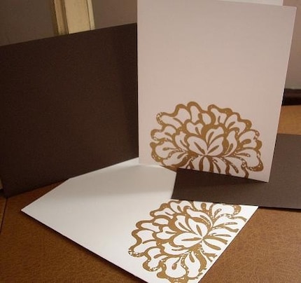
Sometimes a mistake can turn out to be exactly what you wanted. This design was originally supposed to be completely solid, but for some reason, the screen that I created for it didn't turn out solid. Instead, it created small areas where the ink didn't go through. I ended up loving the design though because of its vintage, tattered feel.

1 comment:
wow, bold & beautiful! love it :)
Post a Comment